Indicina
Improving the merchant's experience for managing loan applications.
April 2021 - November 2021
Visit Website
Background
Indicina is a credit reference agency that helps credit facilities make risk-free credit decisions by leveraging real-time customer data and ML-driven financial analytics. Indicina’s flagship product, Originate, is a loan management system that helps empower businesses to offer credit to customers faster, more securely, and at scale while focusing on their business objectives.
Problem
Every business has a merchant portal in Originate. Originate had outgrown its MVP stage. It became difficult to extend the solution to include new features. There were also requests from clients who wanted more access to data points, more flexibility in the system, and the ability to set up their business processes themselves instead of relying on our team to do so.
Contributions
- User Research
- Information Architecture
- Interface Design
- Product Strategy
Collaborators
- Tide Ayeni - Head of Product
- Temitope Akinremi - Customer Success Manager
- Ajayi Damilola - Product Designer
- Bello Oladipupo - Engineering Manager
- Femi Ogunbode - Data Science Lead
- Akolade Omotosho - Design Agency Partner (ASB Technologies)
Goal
The solution was to create Originate 2.0, which would be able to handle more data points, more features, and increased flexibility.
Outcome
The improved merchant portal helped our customers set up their loan products, a reduction in the manual support of the technical team by 65%, thereby channeling their productivity towards building more essential features. Merchants loved the new updates in information architecture as it modeled their work environment. Ultimately, it helped drive the company's revenue upwards as Indicina saw a 100% increase in merchants onboarded.
My role
I worked as the lead product designer with a cross-functional team, including product management, customer success, data science, and an engineering team to deliver Originate 2.0. I collaborated with the product team to define the product strategy. I also collaborated with the customer success team to conduct user research and usability testing. My responsibilities included organizing and managing research and design, prototyping, and iterating through multiple rounds of testing, gathering feedback from stakeholders, and delivering designs that met business goals while maintaining technical constraints for Originate 2.0.
Research
To kickstart the project and properly understand the problems Originate 2.0 was looking to solve, I researched using the following methodologies: the Heuristics Evaluation of Originate 1.0 and the Analysis of over 200 Hotjar sessions of Originate 1.0. Also, in collaboration with the Head of Product and Customer Success Manager, we evaluated the merchant requests received by the CS team. Some of the solutions had already been implemented in Originate 1.0 and would eventually become carry-overs to 2.0. I also conducted six remote user interviews with merchants to understand the problems they were facing using the products.
- Merchants require more flexibility in managing users within their organization.
- Merchants wanted to take ownership of the creation and management of loan products without reaching out to the technical team.
- Merchants require more information that is used in loan application approval decisions.
- Merchants needed to see more analytics on how they were faring as an organization.
- Information architecture, nomenclature, and site navigation needed improvements to model real-world scenarios.
The Solution
Improved Site Navigation and Nomenclature on the Application
The first step was to create improved site navigation and update some of the naming conventions. During the user interviews, merchants noted that they did not understand some of the terms used on the site and differed from their team terms. Luckily, this was true across most merchants after conducting a survey, making updating the terms easier. The sitemap was iterated with the Head of Product and Customer Success Manager until it was decided that it was perfect.
Application
Microfinance Entities (MFBs & MFIs) typically run structures that involve various approval stages before a decision is made on a loan. Officers with different access levels would most likely interact with a loan application at different stages with each officer having a specific function which forms a workflow. This workflow is solely aimed at mitigating the risk exposure of the loan provider by ensuring all due-diligence is performed. Our merchant portal needed to mimic this workflow in order to provide value to our clients.
Analytics and Reporting
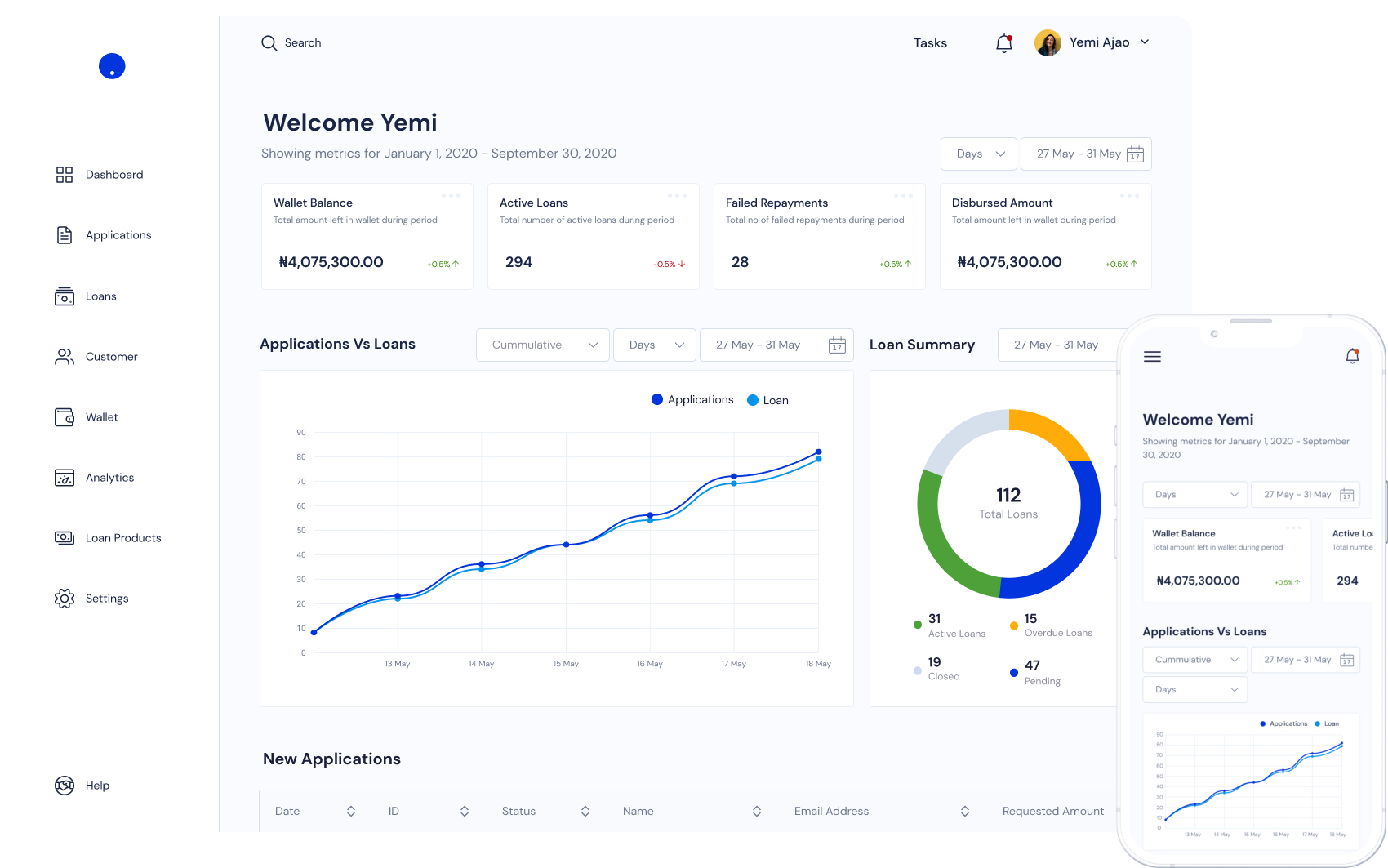
Old merchant portal didn't have a dashboard overview page and analytics page and customers wanted more insights into analytics. We introduced a dashboard overview page for short breakdowns of the analytics, and added a secondary page called "Analytics" which was so much more detailed. Our initial iteration of the analytics page, had us adding all the analytics on each of their related pages. Eg. Customer analytics showed on the customer page, application analytics showed on the analytics page. We found a problem with this iteration after sharing with our internal data team. Our current design doesn't take care of one of the user personas for the portals which are the auditors, who will need audit the company's data from time to time. It was therefore important to ensure that most reporting sit on one page to avoid auditors needing to jump from one page to the other. This informed our decision to create a separate analytics page.
User Management
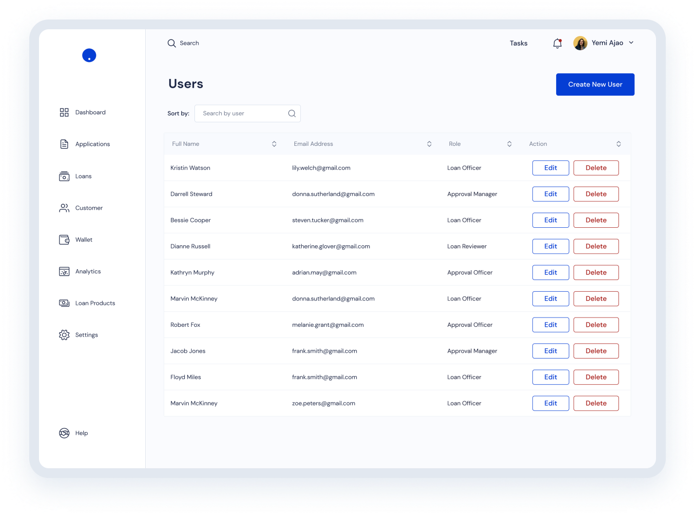
On the old portal design, all existing users with the merchants team had admin access levels and there was no control on typically what each of these users could do or see on the application. We initially created a list of default user types for the merchants and assigned fixed roles to them. After presenting the wireframes to the merchants, some of them noted that they needed more flexibility in user types created and wanted to be able to assign/unassign specific roles to these user types. They also wanted to be able to create their own custom user types based on their needs internally. Using this insight, we created a section for creating, editing and managing user roles in your application.


Loan Product
Microfinance Entities (MFBs & MFIs) typically run structures that involve various approval stages before a decision is made on a loan. Officers with different access levels would most likely interact with a loan application at different stages with each officer having a specific function which forms a workflow. This workflow is solely aimed at mitigating the risk exposure of the loan provider by ensuring all due-diligence is performed. Our merchant portal needed to mimic this workflow in order to provide value to our clients.

Creating a design system
Indicina had also just undergone a rebranding. We saw this as a good opportunity to create a design system. I collaborated with our design agency partner, ASB Technologies, to craft the design system. This was really eye-opening because even though we were designing for our own brand, we also had to take into account the merchants branding as well. We tested each component against some of our existing merchants' brands before marking as completed. We utilized mostly flat designs, no illustrations or patterns to allow for easy integrations with whatever colors our merchants utilizes.

Results
We introduced new features that benefited our merchants and helped drive their revenue. It also helped growing our merchant base by over 70% as our sales team sell the new features. Customers found the new nomenclature and flow easier and this helped free up some time for the customer success team. It is still an iterative process where we keep testing new ways to improve the platform.