Bumpa
Helping small businesses manage their businesses effectively.
August 2021 - October 2021
View app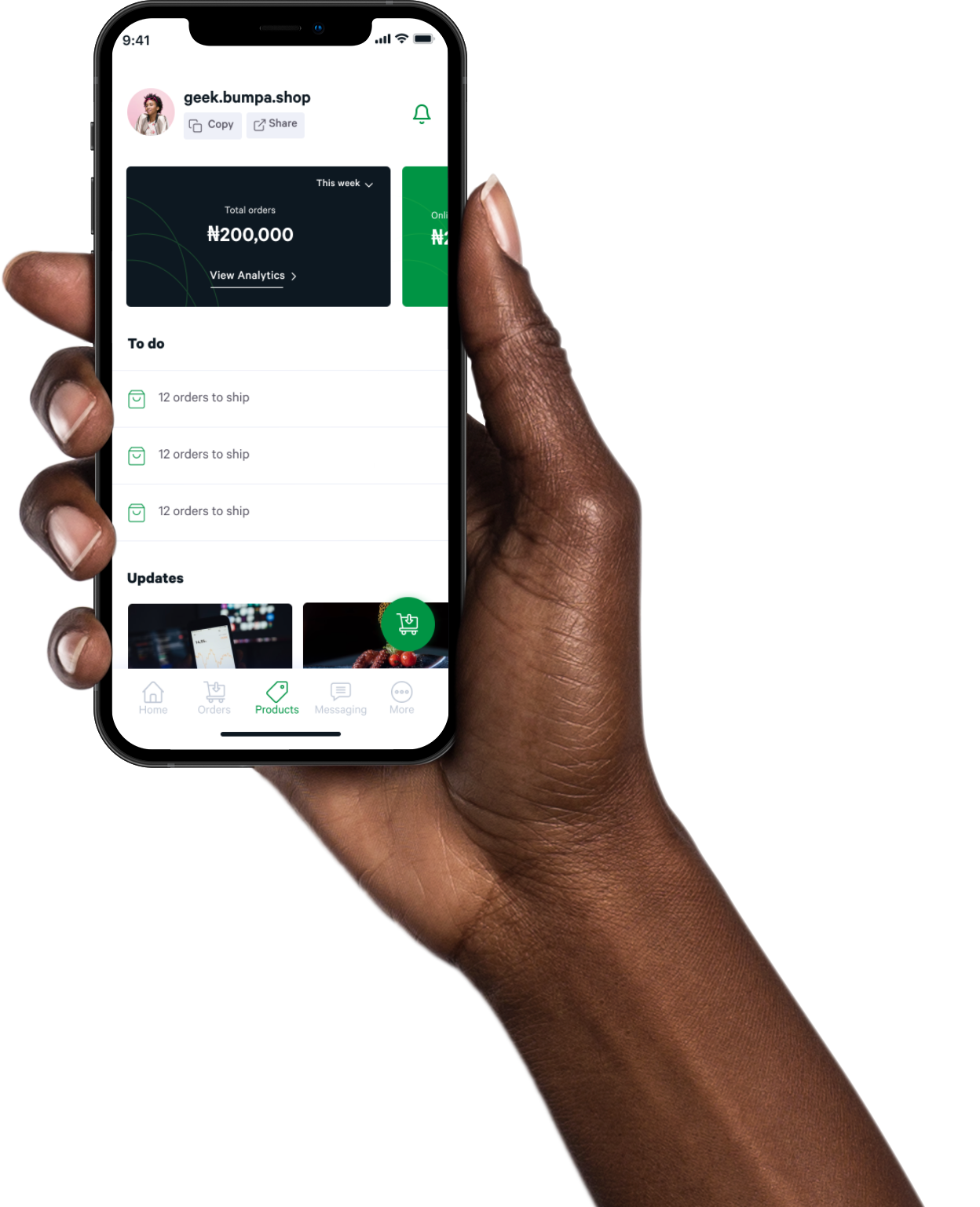
Background
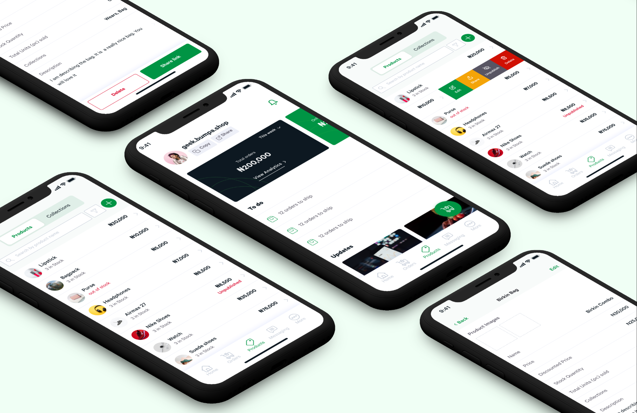
Bumpa is an inventory management system that helps small businesses manage their inventory, drive sales from multiple channels (offline and online), provide enough data to grow their business, and engage with their customers.
Problem
Bumpa was originally known salescabal built in 2017 with 1,500 signups and 1,000 monthly orders. Salescabal’s goal was to provide small and medium businesses with an online store. Salescabal struggled to scale due to poor market fit, usability issues with the platform and a fight for market share with similar products.
Contributions
- User Research
- Information Architecture
- Interface Design
- Product Strategy
- Brand Design
Collaborators
- Kelvin Umechukwu - Product Owner
- Adetunji Opaleye - Engineering Lead
- Stephen Ojo- Mobile Engineer
Goal
Improve the customer experience of the mobile app, thereby helping the business scale and grow their user base. The measures of success were increase in number of signups, increase in monthly orders recorded on the app, increase in gross merchant value.
Outcome
Over 70k signups after the redesign process completed, compared to the initial 1k subscribers, over $1m GMV compared to the initial $8k GMV, 14k+ orders monthly orders recorded compared to the initial 283 monthly orders , $800k pre-seed raised
My role
I collaborated with the Product Owner to define the product strategy, conduct user research and usability testing. I also led the visual design efforts, from branding to UI Design and collaborated with the developers to ensure it was adequately implemented.
Research
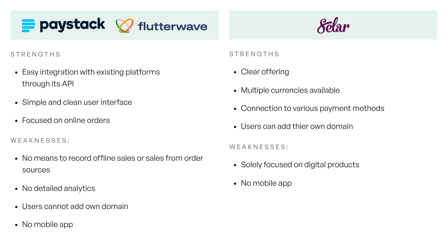
To properly understand the problem to be solved, I conducted research using the following methods: Heuristics evaluation of the existing application, competitive analysis of existing competitors, and remote user interviews. We evaluated existing products and looked into other markets essential towards learning from them. Remote user interviews were conducted with 10 participants over zoom and whatsapp. Participants were recruited from existing Bumpa customers and churned customers. Here are some of the questions asked:
- What type of business do you run?
- Do you have a physical store?
- Do you sell online on any social media platform? Which ones do you sell on?
- What are the channels you recieve the most sales from?
- What’s your most used feature on the app? and what’s your least used feature on the app?
- What features require improvements on the current Salescabal app?
- What are the features that are currently not existing on the app that can help you and your business?
KEY FINDINGS
- Only about 10% of the monthly orders were online orders. Users had more offline sales and sales via Instagram, Whatsapp and Facebook.
- The process for adding products on the app was too long, and does not replicate their real world scenarios.
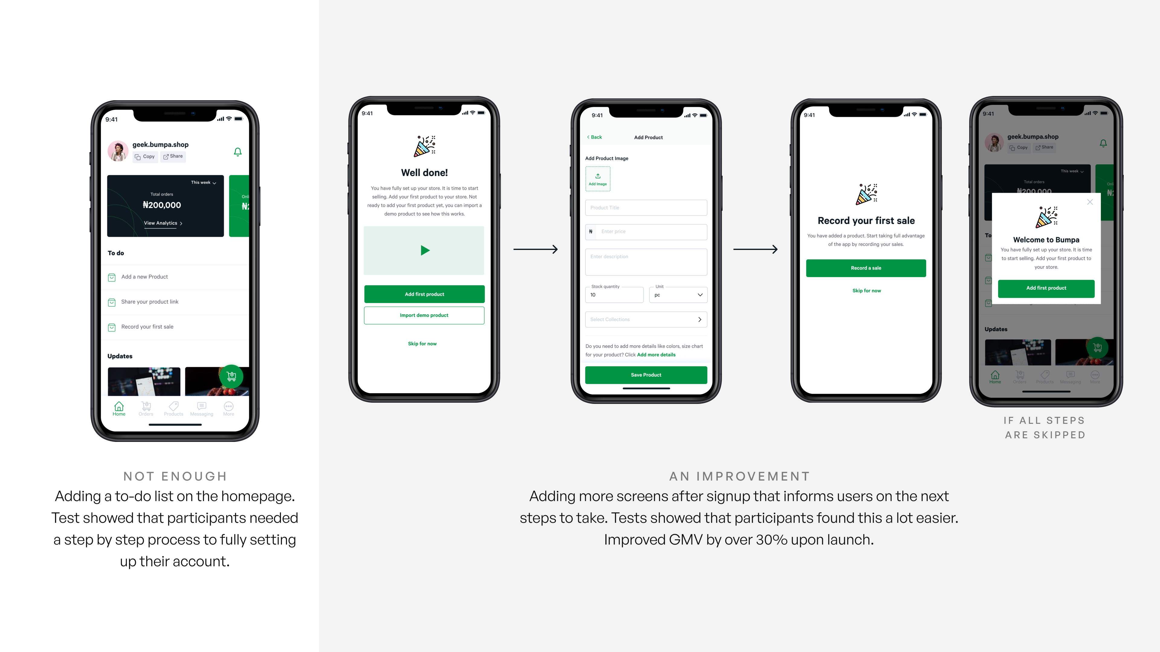
- New Users were confused on what to do after signing up, and this led to them not using the app as they should.
- What are the channels you recieve the most sales from?
- Users required more comprehensive analytics on the state of their business.
Community-Driven Iterative Design Process
We wanted to move fast and break things, so we can learn more from our customers. We created a community of beta-testers of ideas we had in ways the product could evolve. We wanted to leave an open line of communication for our customers to reach us so we can learn what they require the most for the product, and how the product can evolve. I constantly tested the ideas of the product either by conducting user interviews with them, demoing what we were currently working on, and received valuable feedback. Some of the important sections improved on the app are:
Improved onboarding experience
The initial onboarding was a simple sign-up process, and users were left confused about what to do after setting up their accounts. Our first iteration had a to-do list on the homepage. Our initial assumption that users can easily find the to-do list and know what to do proved untrue. Users wanted everything spelled out step by step.
Ease of adding a product
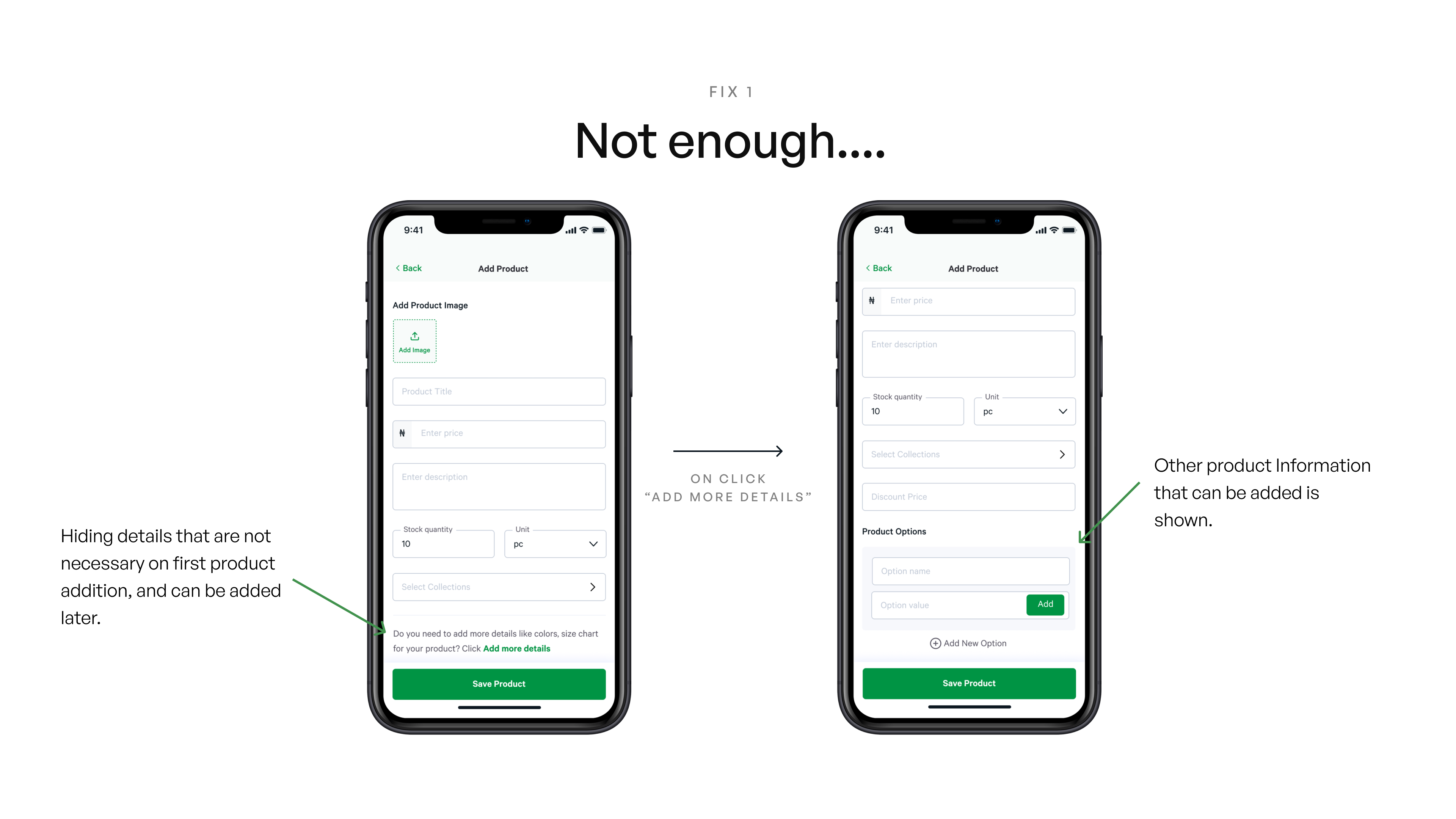
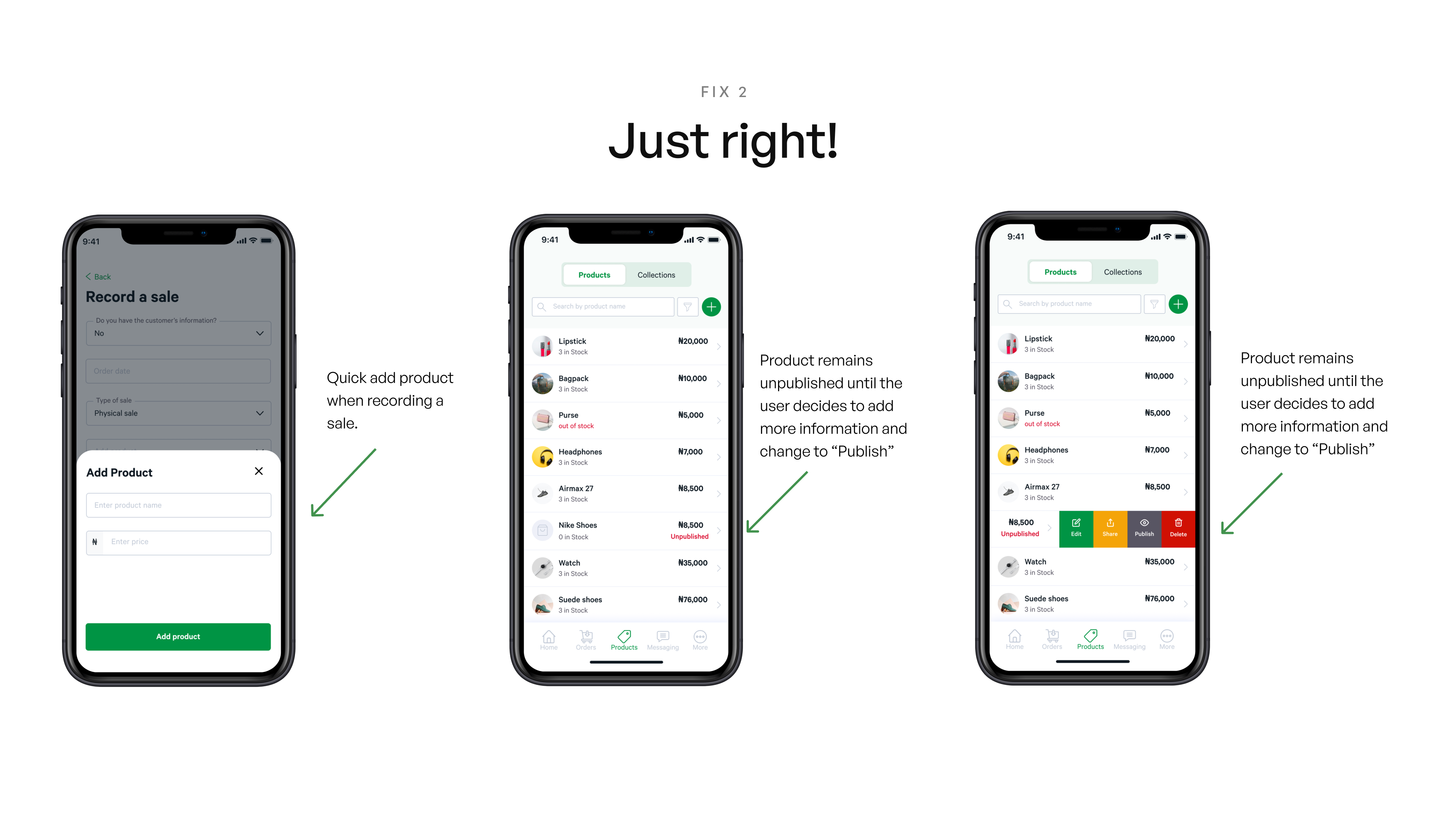
The initial flow for adding a product was a long-form which users found overwhelming to fill when they had more products. They also found that some details weren’t particularly relevant to their type of business, e.g., adding product options, which dissuaded them from adding the products. The goal for this section was to reduce the time needed to add a new product, providing flexibility for adding products. First, we introduced a quick method that allows users to add the product when they are recording an order. This way, they don’t need to add the products before using the app. Also, we introduced a minified version of the add product page, and users can add more details if they need to add more information about the products.
Simplifying order status
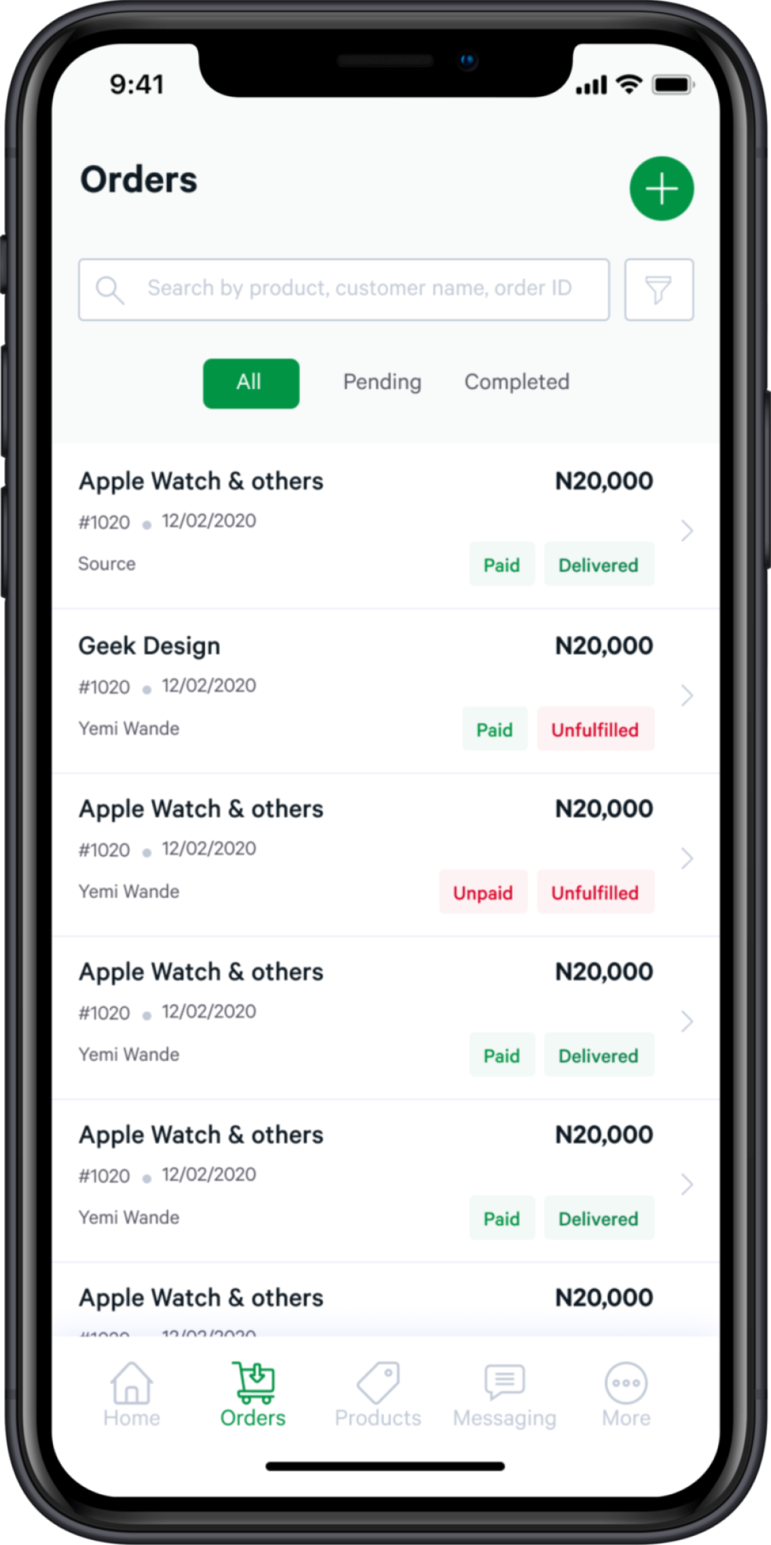
We modeled our initial order status after existing products in other markets, showing paid, unpaid, fulfilled, unfulfilled. Users found it hard to group each of the orders. Users wanted a more straightforward way to know the orders that required more actions. So while we kept the vocabulary, we changed the filters to enable users to get a quick result on orders they need to complete. We introduced “All,” “Pending - unfulfilled or unpaid orders,” “completed - paid & delivered” orders.
Before

After
Introducing a comprehensive data analytics
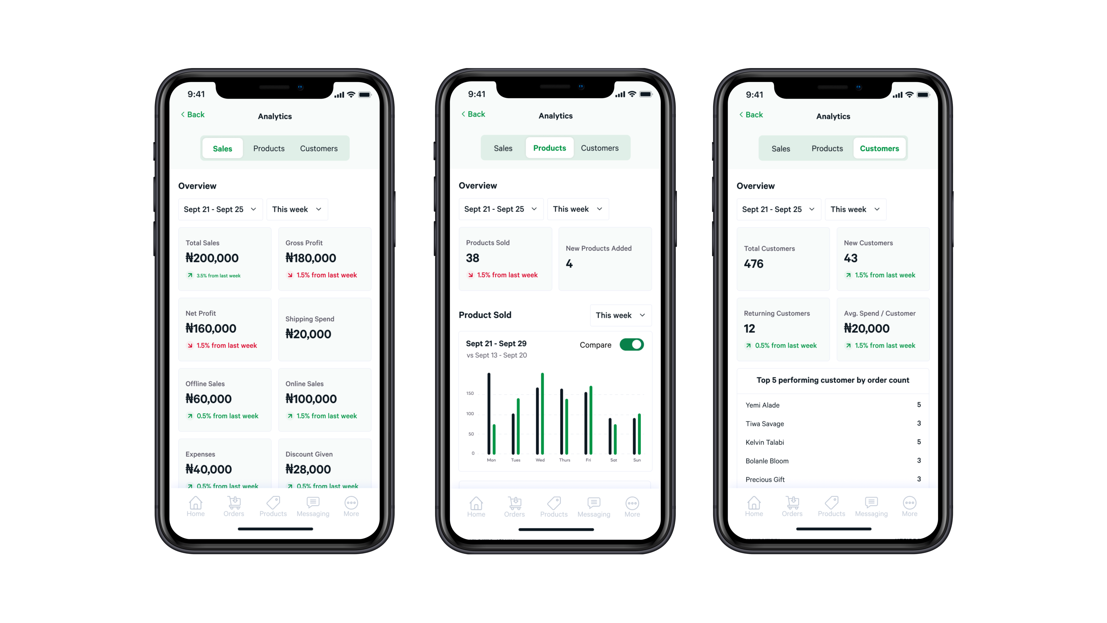
We asked users what important details are needed to help them make better informed business decisions and introduced an analytics page to application.
Key Takeaways
It was an amazing experience working on the product with the founders, seeing the traction they are on at the moment makes me happy. As with every experience, here are my major takewaways:
Prioritize Experience Over Features
A startup means you have to make hard calls. You have to decide what to cut out to ship on time. I learned this balance— while still sticking to quality. It worked well because people responded to our difference in quality.
Don't be too precious over an idea.
The product has gone through many versions, some of them made public. It’s important not to hesitate to kill your babies. I debate with the product owner and mobile engineer for the best ideas. When we see a good idea, we take it; it's best for the product.
You can do more with less
A large team might not be necessarily needed to deliver the best products. I learnt innovative ways to test ideas fast and quickly.
