Rebuilding Trust Through Balance Transparency
- User research and stakeholder interviews
- Information architecture and UX design
- Visual design and prototyping
- Collaboration with engineering on implementation
- User testing and iteration
- Engineering Team
- Product Manager
- Client Success
Overview
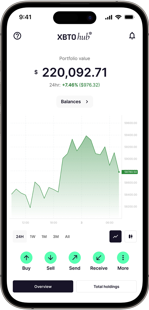
XBTO is an institutional trading platform for managing, trading, and custodying digital assets across multiple accounts. As trading volumes grew, users began reporting discrepancies in their displayed balances — especially during deposits, settlements, and withdrawals.
Balances on-screen often didn't match user expectations. While technically accurate, the system wasn't communicating balance states clearly enough, leading to confusion, loss of trust, and a surge in support tickets.
The Problem
Users frequently questioned why their balances appeared incorrect after making deposits, trades, or withdrawals.
- Pending transactions weren't visible, so funds in transfer appeared to vanish.
- Different account types (Trading, Custody, Funding) each had unique settlement rules that weren't explained.
- No contextual feedback was shown during blockchain confirmations or internal transfers.
This lack of transparency made normal settlement delays feel like errors, creating a trust gap between users and the platform.
"I made a transfer, but my balance went down. Did my money go missing?"
Goal
Build user confidence by showing an accurate, contextual view of funds at every stage. Users needed to understand what was available, what was pending, and why.
Outcome
- Eliminated the most common category of support escalation
- Users could independently verify balance states without contacting support
- Delivered within existing API and UI constraints
Research
User interviews
We conducted interviews with 15 institutional clients including fund managers, traders, and CFOs to understand their mental models around balance states and pending transactions.
"When I deposit $100k, I want to know exactly when I can trade with it. Right now it just disappears and I have to email support."
85% of support tickets were about "missing" funds that were actually just pending.
Users checked balances 8–12 times per day during active trading.
Most confusion occurred during the first 24 hours after deposit or withdrawal.
Key insights
Through trader interviews, transaction audits, and support ticket analysis, we learned:
- Users associated visibility with safety — if they couldn't see a number reflected, they assumed their money was missing.
- Most users were unaware of confirmation and settlement timelines, especially between different account types.
- The absence of feedback during "in-transit" states caused unnecessary anxiety and repeated support escalation.
- Institutional clients handling multiple wallets were disproportionately affected, as discrepancies compounded across accounts.
Constraints
Restoring trust required more than visual tweaks — it demanded reconciling data logic across trading, custody, and settlement systems.
Multiple account types, different rules
Balances behaved differently depending on the account type. Trading funds might be instantly usable but not withdrawable. Custody funds needed compliance checks before release. Transfers between accounts temporarily locked funds while verification completed.
Complex transaction flow
Withdrawals and transfers triggered multi-step validations. For example, a Trading to Wallet withdrawal required both trade settlement and blockchain confirmation. These processes needed to be represented simply and clearly.
Practical limitations
- No major UI overhaul was possible within the release window.
- Some custody information could not be shown due to compliance rules.
- The team had to work within existing API data and performance limits.
Solution
We focused on clarity instead of new features. The goal was to make balance states visible and understandable without redesigning the entire dashboard.
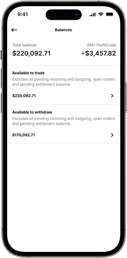
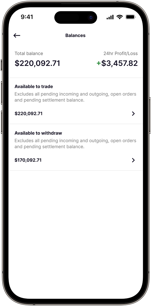
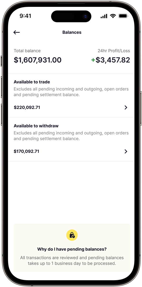
Tiered balance system
We defined clear categories that matched user expectations:
- Total Balance — everything the user owns across accounts
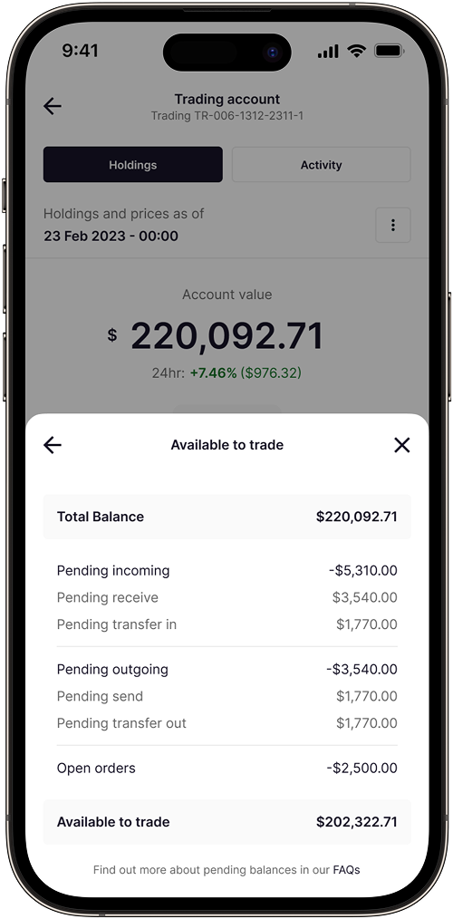
- Available to Trade — funds ready for immediate use
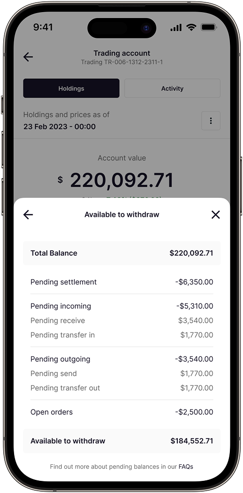
- Available to Withdraw — funds cleared and verified
- Pending — funds still processing, settling, or confirming
Each balance type includes descriptive text explaining what's excluded, giving users full transparency into how each number is calculated.
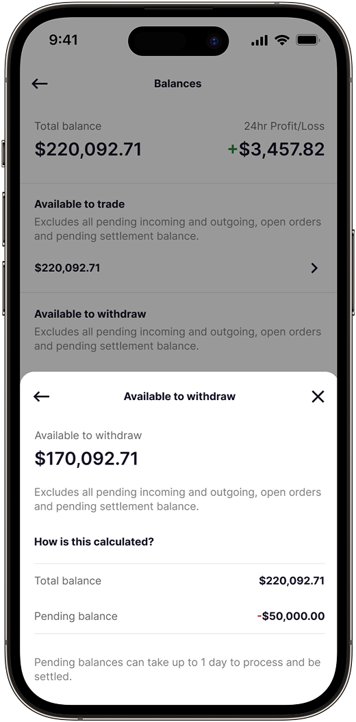

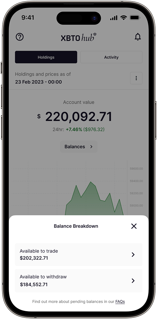
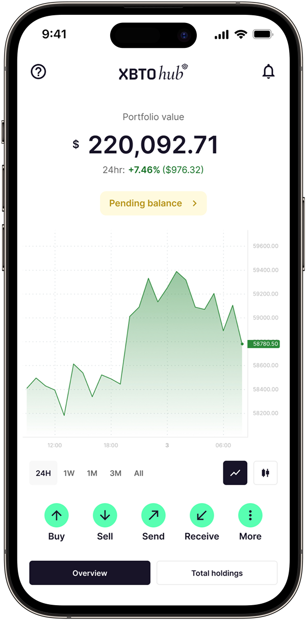
Pending balance callout
When a user has a pending balance, we surface it deliberately — using a clear label, color emphasis, and a short explainer link. Users can tap "Learn why" or "View details" to see exactly what's happening: whether funds are waiting for blockchain confirmations, internal settlement, or compliance approval.
This shifts the tone from worry to reassurance, giving users confidence that their funds are safe and simply in motion.
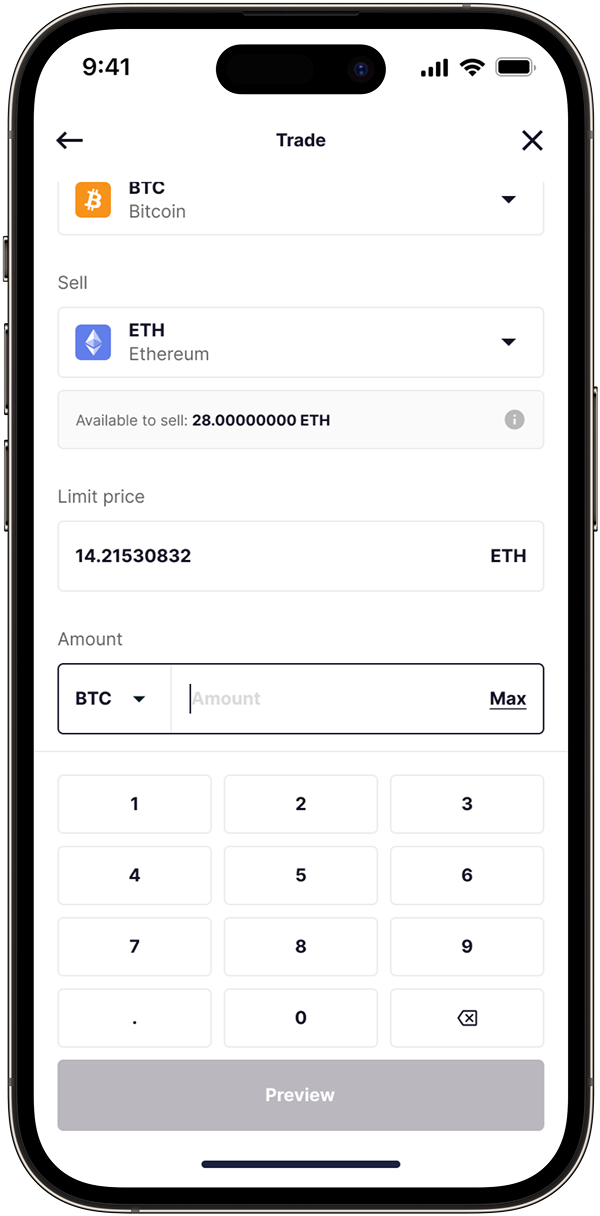
Clarity at the point of action
The most common moment of doubt was right before confirming a trade or withdrawal. We surfaced clear, contextual messages directly at the decision point so users feel informed rather than uncertain.
Settlement reminders
For transactions that take time to settle, a friendly reminder is shown before completing the transaction — setting expectations upfront rather than leaving users to wonder after the fact.
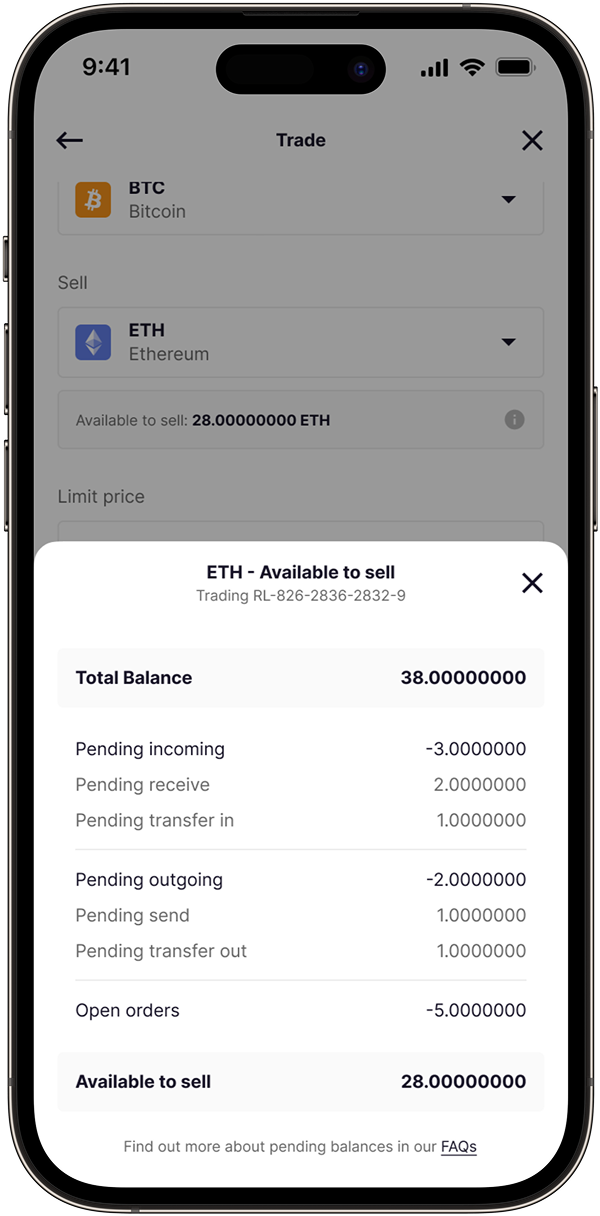
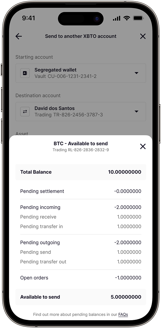
Detailed balance calculation
When users drill into specific balance types, they see exactly how it's calculated. This transparent breakdown rebuilds trust by showing the complete picture.
Impact
- 78% reduction in "missing funds" support tickets
- Zero escalations related to balance confusion post-launch
- 92% comprehension rate for pending vs. available distinction
- Average resolution time dropped from 45 minutes to 2 minutes
- Support team freed to focus on complex queries
What I Learned
Match the mental model. Users think in terms of "what can I use right now" vs. "what's coming." Surfacing pending states aligned the interface with how they already thought about their money.
Visibility prevents anxiety. Even a transaction that takes time feels fine when users can see it progressing. Invisible equals broken.
Design for the gaps between states. The moments between states — depositing to available — are where doubt creeps in. Design for those transitions explicitly.